
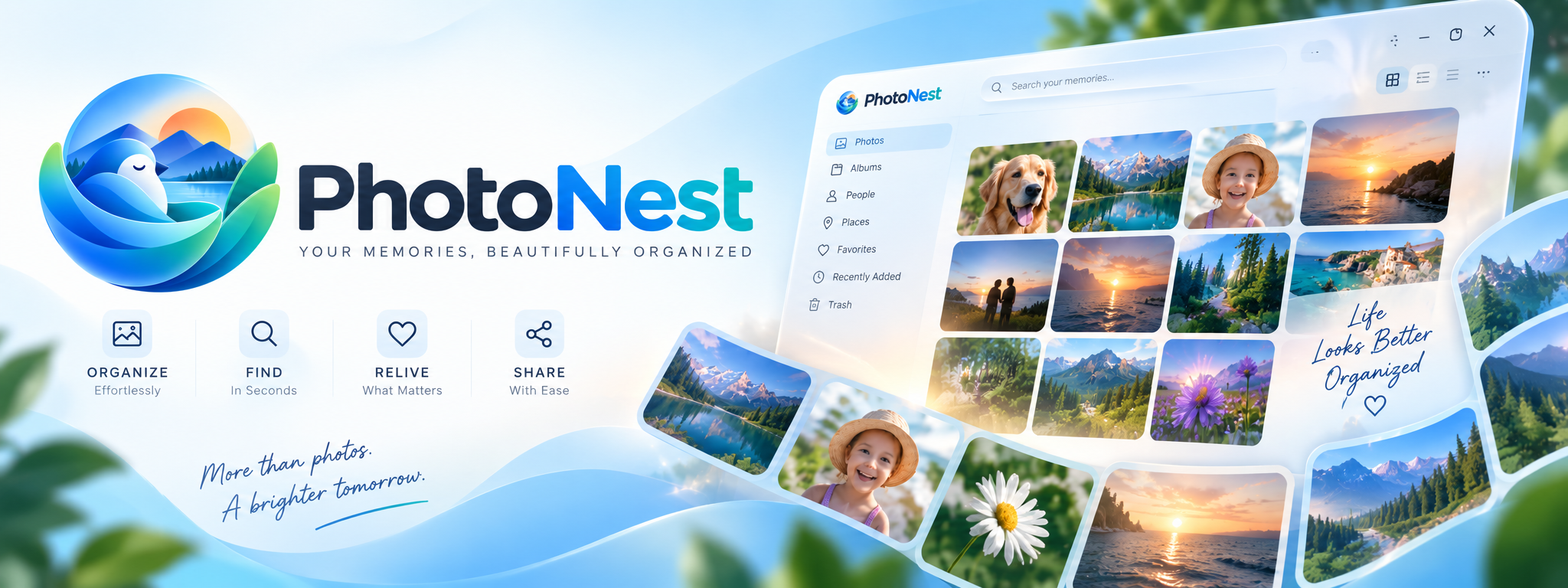
Most photo libraries already have a structure before they ever reach an organizer. They live in folders, folders inside folders, folders named for people, places, seasons, projects, and ordinary days that were worth keeping. PhotoNest is being built around that reality.
It is a Windows photo organizer for bringing an existing collection into a calmer workspace without asking the owner to abandon the structure they already made. The project is currently in development, with its source kept in a private GitHub repository and no public installer or release published yet.
Start with the folder that already exists
PhotoNest is designed to scan an existing folder in place. The goal is not to force a second copy of a personal library or quietly rearrange original files. The application indexes the media it finds, keeps the source paths meaningful, and presents the collection through a gallery that can be browsed by time, folder, album, People, and other views.
Subdirectories are treated as albums automatically. That small decision is important because a folder tree often contains the most honest description of a collection. A directory named Rahma - Beach should be useful as an album without requiring the user to rebuild it manually. A folder manager is also part of the workflow, giving each source a clear choice between scanning once, continuing to watch for new files, or being removed from PhotoNest without touching the original media.
Scanning is meant to be visible rather than mysterious. When a source is being read, PhotoNest shows indexing and scan activity so the user can see that image discovery, thumbnail work, metadata reading, and later analysis are separate pieces of a background process. If a folder cannot be read or its metadata is incomplete, the application should explain that state and keep the original file unchanged.
People should become identities, not repeated labels
The People section is one of the areas receiving the most deliberate attention. PhotoNest is being shaped around the useful part of Picasa’s old approach: a face group can begin as unnamed, become a remembered identity, and then help organize later matches.
Face analysis is not intended to run from scratch every time the application launches. It is an explicit, controllable indexing task that can be started when the user chooses to scan or rescan. In a single-photo view, face detection can be toggled on so each detected face can be reviewed and named. A photograph containing two people should expose two face regions, allowing both identities to be assigned independently rather than treating the whole image as one person.
Once a name has been registered, it represents an identity. Naming another face should offer the existing people and their portrait references instead of treating the same name as a brand-new category. PhotoNest can then perform a similarity pass and suggest other images that may belong to that person. Suggestions remain reviewable: recognition should assist organization, not silently rewrite a personal library.
The face presentation matters just as much as the underlying grouping. Portrait thumbnails should be tight crops around the actual face, without large areas of shoulders or empty background. Named people and unnamed groups should be separated clearly, with each person opening a focused view containing only the photos associated with that identity. That gives the People section a purpose beyond being a list of detected rectangles.
A glass workspace with practical controls underneath
The visual direction comes from the supplied PhotoNest concept: a soft glass workspace, a clear left navigation rail, a time-based gallery, and a right-hand details panel for the selected image. The design is being adapted into a real desktop application rather than treated as a static mockup.
That includes proper Windows sizing behavior across windowed, maximized, fullscreen, borderless, compact, expanded, focus, split, and multi-panel arrangements. The photo viewer is being rebuilt around the things people actually need while looking at a single image: close, favorite, fullscreen, edit, delete, navigation arrows close to the image, a thumbnail strip, zoom, and responsive panning. Dark mode has its own direction too—the dark state is intended to be genuinely black and quiet, while the light state keeps the original glass appearance.
The rest of the library is growing around the same principle. Albums are their own mode instead of another label on the Photos screen. Folder views are divided by source or group so it is clear where images came from. Tools include duplicate detection, and selection actions such as adding to an album or tray are being made into proper, dependable workflows rather than decorative buttons.
Designed for clarity, honest about the work ahead
PhotoNest is currently listed on the Majestic Creations project page as a project in development. Its source repository is private, and the project uses Electron and React for the desktop interface with a C++ foundation for native catalog and filesystem work. The guiding promise is simple: organize the library without taking ownership away from the person who created it.
There is still important work ahead. Face recognition needs broader real-library testing, metadata handling needs to remain dependable across image formats and imperfect files, and Windows performance needs to be tested against large folders and slower drives. The visual system also needs continued refinement at different display sizes, especially around the viewer, People review, and long-running scans.
For now, PhotoNest is a foundation taking shape: a Windows application that respects existing folders, makes scanning visible, turns subdirectories into albums, remembers people as identities, and gives a personal photo library room to become understandable again.